|
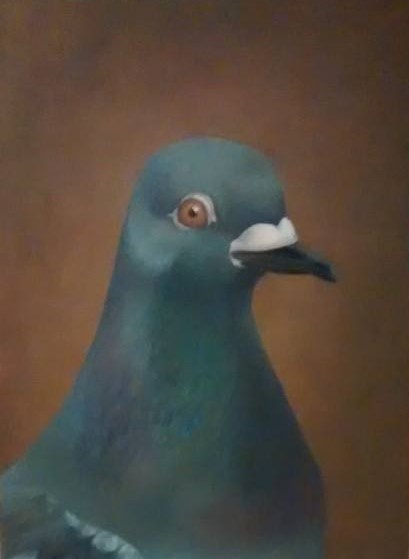
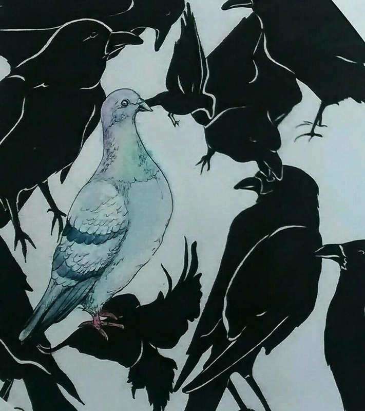
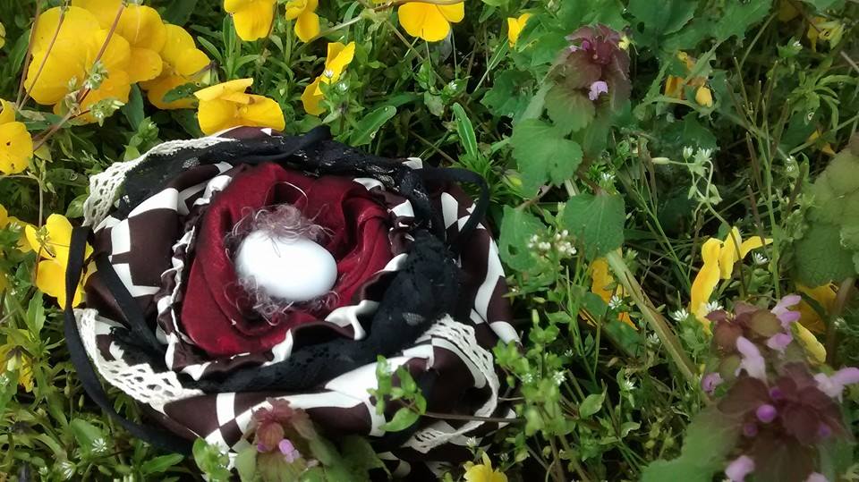
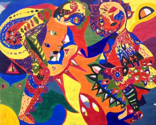
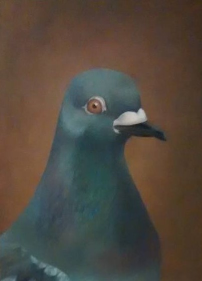
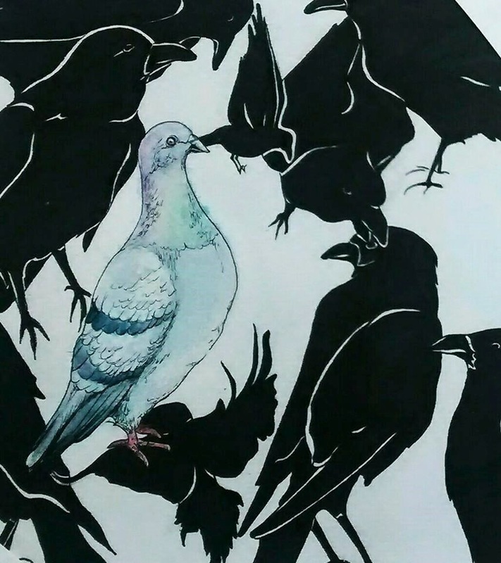
The following is a critical analysis of my series 'Vogue' from The Pigeon Project, written by Safira Taylor (also a student of Minerva Art Academy). It is great to see her understanding of my work and ethics as well as being able to view the work from another's perspective. [This text has been published with consent from the author and all opinions are her own.] 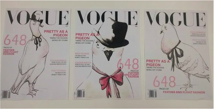 Research Assignment Safira Taylor 1. Visual Analysis (ca)= cause words (co)= comparison words (ef)= effect words When first confronted with this panel of Vogue covers, a reassuring feeling comes over me (ef). I immediately recognize the composition (ca) and the text; the famous Vogue magazine (co). The stylistic drawings of the pigeons are painted in unsaturated peachy colours (ca) that trigger thoughts of make up artist’s sketches and fashion illustration (co). The drawings are done is such a simple, and beautiful way (ca), the viewer must remind themselves that it is a slim and well proportioned pigeon gracing the cover (ef), rather than a slim and well proportioned model (co). The pigeon covers part of the Vogue title text, but the viewer is able to fill in the missing text themselves, as it is so famous (co). The text on the magazine cover is written as the usual magazine font type, size and colours (co) and reads usual magazine headlines, with a bird twist. ‘Pretty as a pigeon- taking the fashion world by a storm’, the fact that the artist takes the pigeon on the cover so seriously (ca) can be humorous to the viewer (ef). The hand illustrated covers (ca) link to special edition covers done by Vogue (co). They would use hand drawn covers for collector editions. Not only is this a Vogue magazine, but also a collectors edition, adding more worth, and making the pigeon models even more unusual and shocking to the viewer (ef). 2. Works Made Prior to the Analysed Work These works are all part of her series about the glorified pigeon. The first (from left) is in the style of a classical portrait. The pigeon appears to be posing for the artist. The colours are very traditional, and the style is realistic. The second is more-like a printed pattern, it has an all over composition but the pigeon stands out as it is the only bird not painted as a silhouette, this makes the pigeon look innocent and important. The third is a nest. It is made out of silk, and expensive looking materials; they look soft to touch and are royally coloured. Inside is an egg, we can assume it’s a pigeon egg. This work adds value to the idea of the pigeon nest. It shows the worth and importance of it’s home, as well as glorifying it’s birth and existence. Although visually these works are quite different to the Vogue covers, they all contain the pigeon as the central subject. The pigeon is taken out of its context and is made to look more superior. The Vogue covers make the statement more obvious as the juxtaposition between Vogue and a pigeon is more extreme than in the prior artworks. 3. What is the Framework?
Coral is an exchange student so these are works that she made at her art school in Coventry, England, where she is doing Fine Art and Illustration. They were made over a period of eight weeks. Before this series she had created works about aspects of Islamic culture and religion that are unappreciated and incorrectly perceived by the majority of the Western world, this was inspired by a trip volunteering in Jordan. These works were not widely appreciated by her English teachers and peers, so the she decided to work with a more approachable subject. There was no set assignment, but she did have guidance from a tutor. They were presented together as a final series of works. 4. Interview [Please see previous post for full interview] 5. Influence Art Style/Movement/ Artist After speaking with Coral, I thought a lot about what she was trying to achieve through her art. The interview really made me think. In her interview she mentions England a lot and I think her self-proclaimed English sarcasm is a big influence on her work. She is also trying to make her art accessible to everyone to open the eyes and create happiness within all of society. Another artist that also blurs the boundary between the art world and the general public is Banksy. Banksy is a street graffiti artist, also from England. His art is accessible to everyone and there is no monetary value to his art, anyone can view it. He also says a lot about society in humorous ways, which makes it accessible for all sorts of people. Like Coral he aims to create awareness within society, but he does it in ways that don’t necessarily bring happiness to the viewer. 6. Reconstruction Coral is a conceptual artist. She struggles to create work without a strong concept within it. Aesthetically pleasing the viewer comes second to the concept.. This creates a problem for her as she can be limited by her concept when producing art. (P) It is clear to me when I speak with Coral that she has a concept, a very clear one. She knows what she wants to create with her art. I think pigeons are a great metaphor for this concept. While speaking with her we realised that the English art schooling system revolves around a concept more so than at Minerva. Coral uses a lot of comparisons in this series of works. She compares works to Vogue and to a famous portraiture. These comparisons may make it difficult for her to develop her own artistic style. (P)
1 Comment
19/11/2015 0 Comments Engaged Art

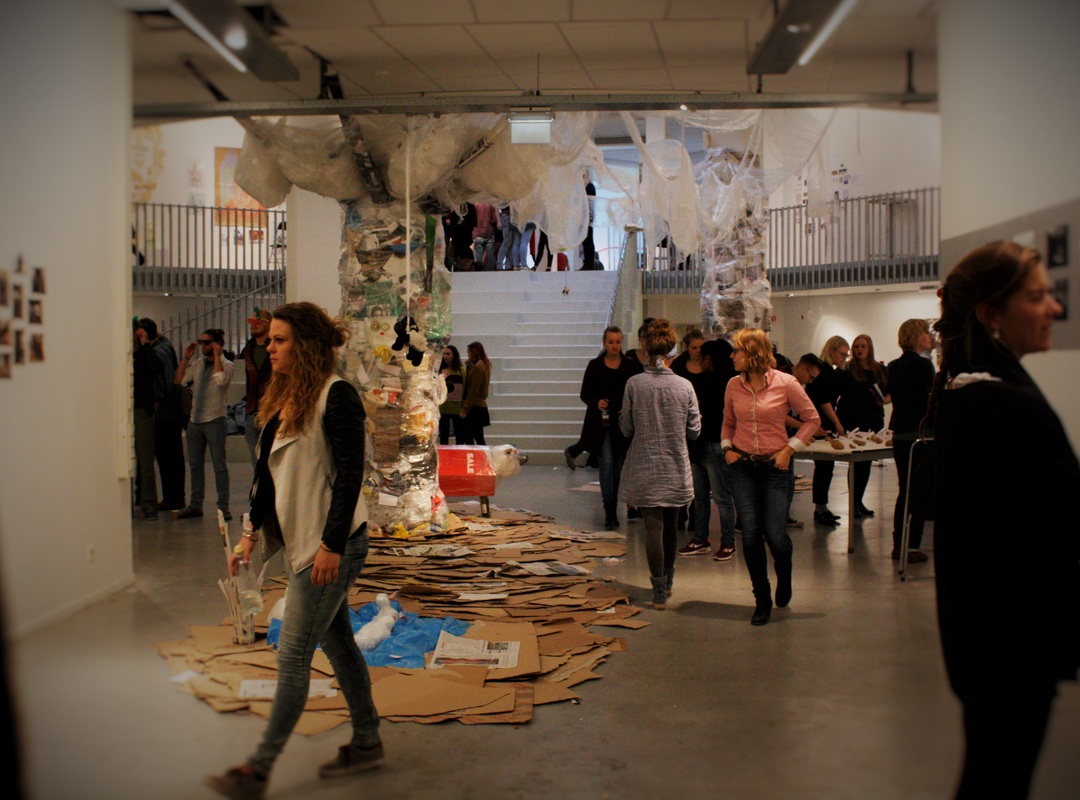 You've completed your deadlines and enjoyed a relaxed sigh spanning a week off while assessments are carried out by the tutors. Now, just as you feel this studying lark might not be too tough after all, Project Week hits. An introduction to the next block that leaves no room for "I'm just getting back into the flow" excuses. This week engages Minerva students from both Art and Design courses in a full-time focussed study experience that creates an opportunity to delve into a set project with no less than hard-core commitment. The product of this you can see above: A bustling show of creative collaborations, artwork, designs and concepts all produced in a single week. This week has been an amazing experience and a fantastic way to kick start those creative cogs for the next block. I knackered, dirty and even my sneezes come out black with charcoal dust, but I've met fantastic people and learnt a lot not only about drawing but also about collaboration, teamwork, dedication and routine. My Project
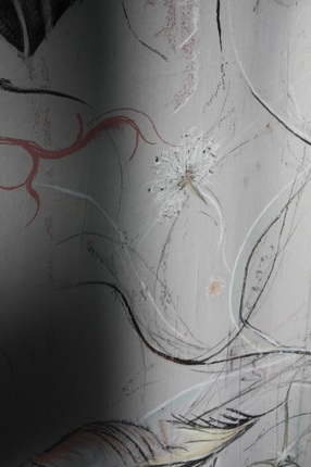
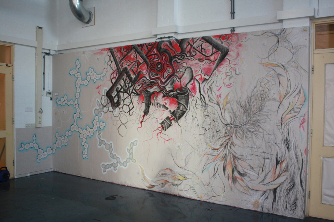
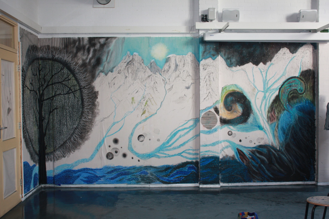
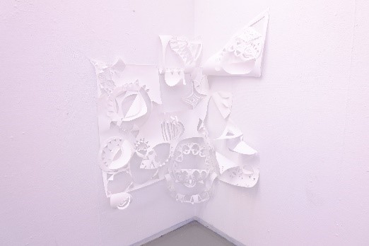
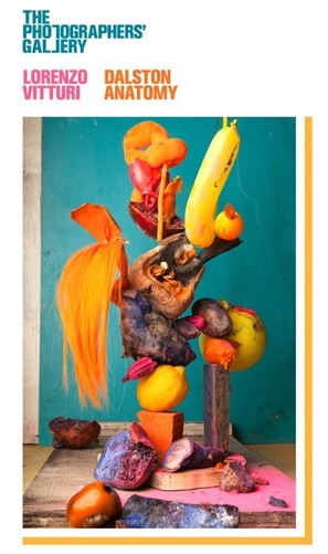
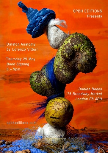
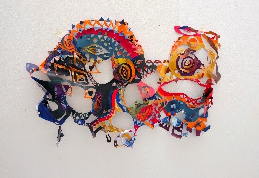
My Finished WorkThe 3 Final Walls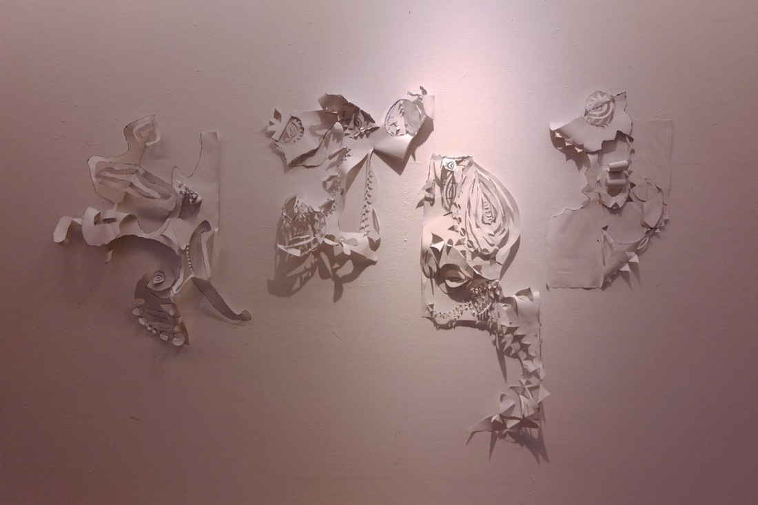 September 2015 (2) 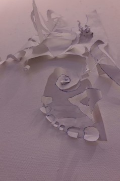 Close up of Sept. '15 (2) Close up of Sept. '15 (2) RESEARCH ANALYSIS -Safira Taylor, Sept. 2015 (2) Encountering the work of Safira Taylor brings foremost to mind one word: Oxymoron. Plain yet complex [CA], a simple technique creating an intricate design [CA] and a three-dimensional result still very much in touch with its two-dimensional beginning [CA]: It is an artwork heavy with playful [EF] contradiction. The papercuts feature geometric shapes cut from large pieces of white paper[CA]. A repetitive and seemingly instinctive process [CA] that could be seen as a frantic [EF] (further supported by the ripped edges and sharp angles) or therapeutic action [EF] (portrayed better by the organic curves and flowing process). Whilst papercuts are predominantly connected to oriental [CO] culture, the pattern use could also reflect the aboriginal [CO] artwork reminiscent of Taylor’s Australian upbringing. Abstract art has the unique quality of unveiling our human nature to search for the recognisable. In 1932, psychologist Bartlett conducted an experiment in which participants had to remember and retell a story from a foreign culture. He found that participants assimilated the story to their own culture, actively producing recognisable elements so that they could better interact and understand it. The same is happening here. One might see mystical [EF] faces or creatures [CO] appearing from within their white camouflage [CO]; becoming surreal skeletons dancing [CO] with the suggested movement of each fold and contortion of the paper [CA]. Further creating atmospheric [EF] shadows that play with our sense of depth and produce tonal variants within the pure white. In today’s hectic, flashy environment, where materials such as paper are overused and underappreciated, the work of Safira Taylor draws attention to its full potential and the potential of humanity to create and see beauty within the small and simplistic. Taylor’s practice has showed a clear and conscious development throughout the past year. Originating from bright, geometrical, figurative paintings, reminiscent of Picasso’s cubist portraiture, her work has transformed to a 3-dimensional manipulation of the painting style. With this development, the work seems to have become instinctively more abstract as she finds enjoyment in the new technique. However, the artist has gradually balanced this complex new form with reduced colour usage, eventually producing an entirely white form. With this piece [Sept. 2015 (1)] a minimum pallet has been achieved from which she has now returned with the use of outline in contrast to the previous block colours. However, whilst these works may all seem very different they all maintain the similar use of shapes and folds as even the 2-dimension work of March 2015 has folded sections within the patterns. This final piece [Sept. 2015 (1)] was created within the boundaries of an installation class that gave her one week to create and display something for her tutor, Suzanne, and her classmates to critique. This framework produced an open environment for Taylor to use her own style whilst encouraging experimentation. Being the fifth week of the class, Safira was aiming to develop her practice in order to fully utilise the opinions of her audience, hence leading her to minimise her colour pallet. Meanwhile the week time-frame still provided enough time to find a new way of achieving subtle outlines on the work. 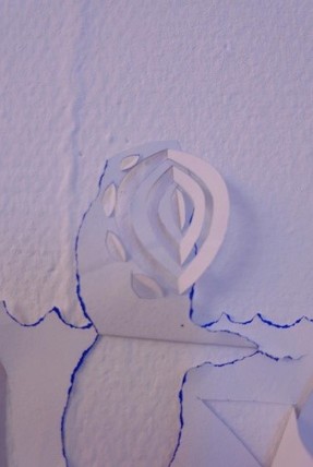 Close up of Sept. '15 (2) Close up of Sept. '15 (2) Interview with the Artist Coral: In this piece you painted blue paper white and ripped the edges to achieve coloured outlines. This is a clear development from your previous paper-cut technique but how did you come to use paper-cuts and how else has this developed for you over time? Safira Taylor: At the beginning of last year I was doing something completely different; I was putting banana skins through a press to make strange prints. I presented that after the first half but no-one was too excited about it as it was very brown. But then I always do these kind of drawings [gesturing to a flowing geometrical pattern doodled in her sketchbook] and one teacher said they were really nice and that maybe I should do something with them. So from that I thought I would do a painting of them but I found this quite boring so once I had painted I wanted to add more detail and that is when I painted the backside of the paper and cut and folded it so that the back colours were revealed. So that was the start of it [showing the painting from March 2015]. Initially these were glued down to keep it flat like a painting and then I just stopped and these 3-dimensional works [May 2015] came about - it really wasn’t planned. So it all really came from my doodles which I think are what I would imagine as generic feminine doodles, so I always thought they would never be anything in my art but they were the things I most enjoyed doing. C: You said where you started from was also printing on paper so what is so special about paper to you? Do you feel there is a cultural reason behind your interest in working with paper or is it purely from a technical or enjoyment point of view? ST: Well I think what I like about it is that I don’t have a plan; paper really allows you to just do it and make a mistake and recover from it easily. I think if I had to plan and prepare I wouldn’t be as interested because it started due to the ease of it and now it is where I am comfortable. I like how paper works and it also helps that it is cheap because then I can make loads and they are not precious things – I can change or throw them away and I don’t have to take five hours to feel ready to start. That planning stage was what I struggled with in the printing work I did before it. So it is probably down to paper being so disposable. C: That is interesting today with the prominent issues of recycling and so on, which perhaps as artists we think less about because it’s a largely used material, but do you feel it has any effect on you how other people view your material? ST: I don’t think it affects me but I guess there is something nice about just paper and acrylics in comparison to these artists that use such expensive materials that their art can be based on material worth rather than skill. I don’t appreciate those works so that might also have affected my choice. C: And the making-process, how does it make you feel using these techniques? ST: I really like it. Painting can get tedious but I often take a long time doing it in front of the TV or with music, it’s very relaxing because there is no thinking involved. C: So do you have any aim, for yourself or your viewers, when you are working or no specific intentions? ST: It is probably more for myself. I think I would rather create a work that I am really happy with than worry about what other people think but I do think because I use bright colours it is quite easy for anyone, whether or not they know a lot about art, to like it. I think if I worry too much about what other people think I wouldn’t do anything and I know that I really enjoy that moment when I fold a piece over and the effect is a complete surprise and I realise it looks good together – that moment is completely for me. C: So that leads me to ask what responses have you received from viewers and what is your reaction to them? That could be from viewers or tutors. ST: I think people generally like it because it is quite easy to look at and it is not about anything political which can put some people off because they don’t care about those things. With my work you don’t have to really think about them but I like to think that also if you want to think deeper maybe there is something behind it. But honestly I don’t know what that is. So in general people usually call them joyous, decorative and childish. C: And do you like or agree with those opinions? ST: Initially I was a bit offended when I presented of about 3 meters of this colourful style and people thought it was so decorative they were comparing it to birthday party decorations. But then I really thought about it and realised decorative art is really cool and and after researching it I now believe ‘decorative’ is a great quality for art to have. So I have come to terms with it all now. C: And from you mentioning a possible deeper meaning, whilst I assume you view your practice as purely abstract, do you find other people or even yourself sometimes find other things in it like it becomes an unintended image? ST: Yes, lots of people do. I have had someone call one of my works ‘the fish one’ and another said ‘oh yes I see the dragon there’ but it is all unintentional and I never see anything. But if someone wants to see something that is fine. I guess it could be compared to the psychology test with the ink spillages. C: Would you say your practice has any cultural links, perhaps to oriental papercuts or aboriginal designs? ST: Initially I would have said no and I wouldn’t have thought about it. I always said I did it in these ways just because I liked it but then I was talking to Bartolt and he compared it to the things I was wearing and how my style comes through in the technique. So then I really thought about it and realised there is definitely quite a lot of cultural influences. Growing up in Australia I saw a lot of aboriginal paintings and now my parents live in Indonesia where the patterns, for example on the ring I am wearing, and the Batik designs all relate to my interest in patterns. Also my mum is part Arabic and my grandfather lived in Zanzibar which is in Tanzania so I have had an Islamic and African influence too. I grew up using these things called Kangas which are like sheets of material with patterns on and I really want my mum to bring some over because they are actually really similar to the colours and shapes that I use. C: And lastly, do you have an artist, art style or art movement that inspires you creating your work? ST: There is a photographer called Lorenzo Vitturi who uses bright colours for example creating a sculpture with rotten fruit that contrasts say an orange with the green mould becoming really beautiful. So I guess he is a big influence on colour. I also really like the French impressionists. I am not a big fan of realistic work for example the common church scenes. In the above interview, Taylor stated that a key artist from whom she draws inspiration is Italian photographer, Lorenzo Vitturi. The most conspicuous similarity between the practices of these two artists is, as mentioned by Taylor, use of colour. Playing with bright, contrasting colours that grab the viewer’s attention and create a surreal and unexpected composition. Whilst Vitturi’s photographs display an intentional sculpture, Taylor’s work differs with her use of unplanned folds that juxtapose colours unexpected even to the artist herself. However, the piece discussed here can be more closely related to the process of Vitturi as, although her reduced palette visually opposes that of Vitturi’s fruit, her preparation of painting the blue paper and planning to cause the contrasted blue and white with ripped edges follows his planned, sourced and constructed sculptures. Meanwhile, despite being in photographic form, Vitturi’s seemingly balanced sculptures twist, curve and peel in a form not unlike Taylors manipulated paper.
Safira Taylor’s practice began this year as a colourful depiction of the multicultural patterns [v] relating to her family and upbringing [c]. During the process of developing this technique she searched for a way to add interest as well as lively, unexpected compositions [p]; leading her to experiment with three-dimensional folds [v] and an unplanned, intuitive process. However, removing the planning stage that she had disliked in her previous printing work [p] creates opportunities for mistakes to be made and changes needed [p]. This confirmed for the artist her need for inexpensive materials considered disposable in today’s culture [c], invoking a material use purely focussed on paper [v]. This decision was further supported by her dislike for material worth amidst the art world [c], inspiring her to use acrylics and paper [v] as a display of skill and aesthetics above monetary value [p]. Because of this there is an element of irony in the artist’s decision to minimise her colour palette [v] in the works of September 2015. This decision was provoked from a need to experiment after maximising her colour use and so restricting her forward development in this area [p]. No doubt further induced by the educational framework and expected feedback that requires a continual effort to change and improve [c]. To succeed in this the artist here detracts colour [v], now taking inspiration away from her inherit cultures and focussing on reacting to the art world, or more particularly to the gallery setting of mainstream exhibition standards [c]. However, this sudden disregard of colour [v] could also be described as an experimental or even subconscious reaction to the feedback Taylor had struggled to come to terms with relating to ‘decorative’ art [c]. In the beginning, Taylor received this as an implication that her practice is not serious and so felt it was being undervalued [p]. This is a common misconception fuelled by ‘art-world values’ that discriminate between loose concepts such as: Good and bad, art and craft, serious and commercial [c]. This feedback further inspired a change in shape and size of the work [v]. Taylor recalls the feedback in connection to a large piece three meters in length. Since then she has reduced the size and experimented with more abstracted shapes creating less continual forms [v]. Perhaps the most unique, the chosen piece, seen by Taylor as a single piece that could form part of a similar installation, has been created in four parts [v]. Hence, breaking up the design and giving more focus to each form. This takes the perception away from the party banners and décor previously mentioned and instead introduces the paper as sculptures, twisted and manipulated in a visual fashion not unlike the work of her inspiration, Vitturi [c].
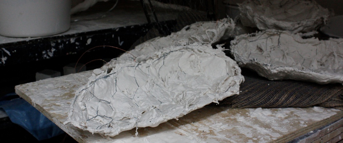
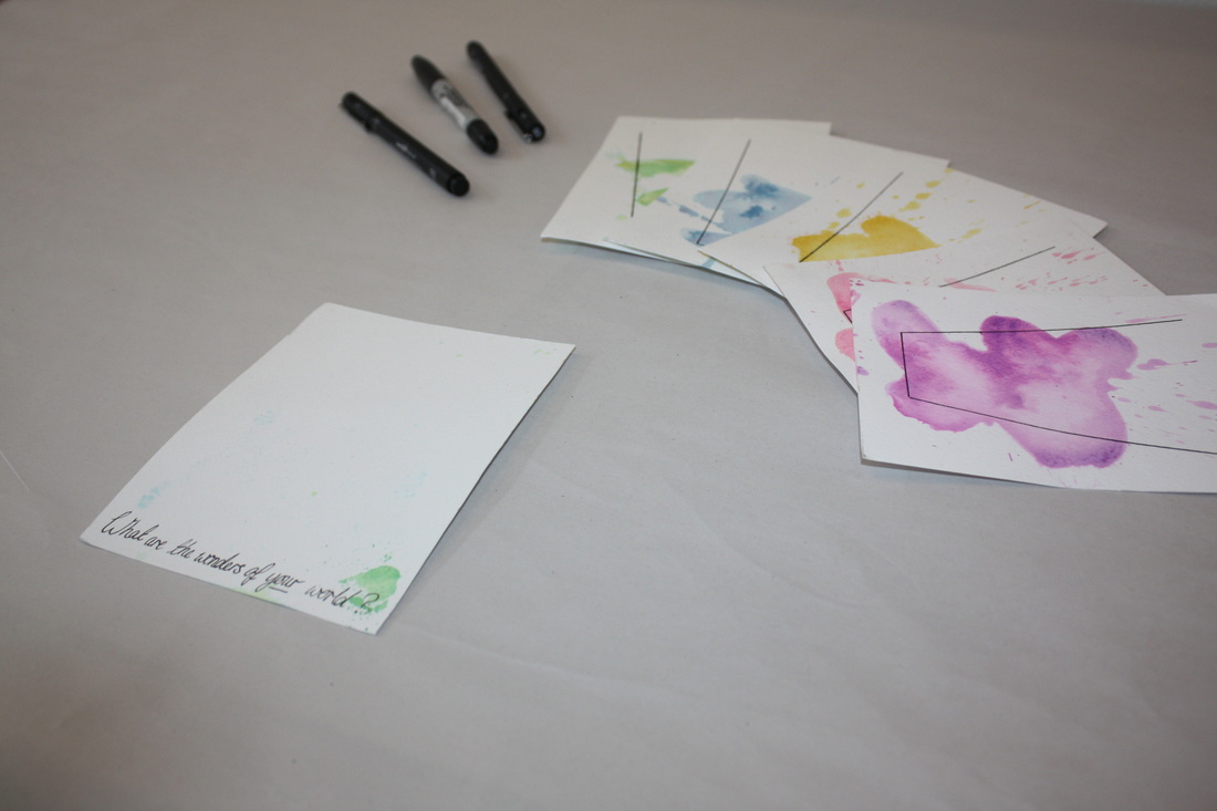
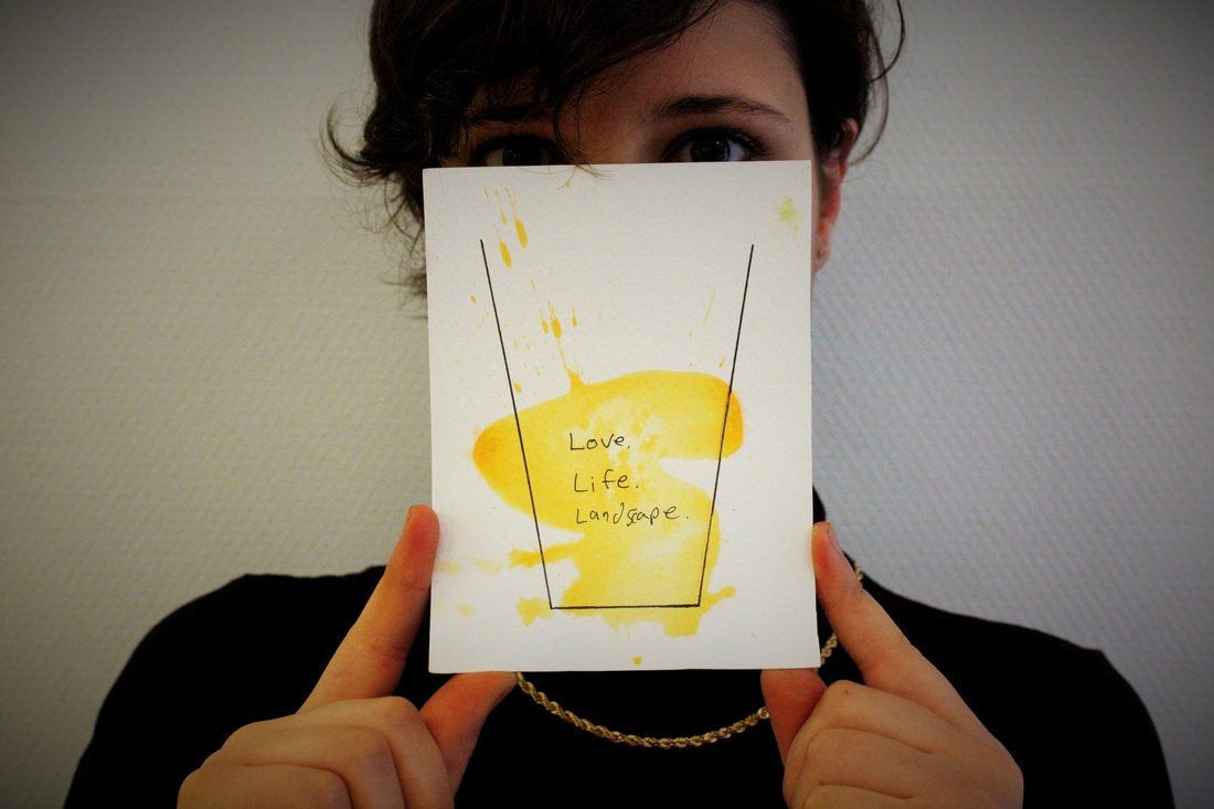
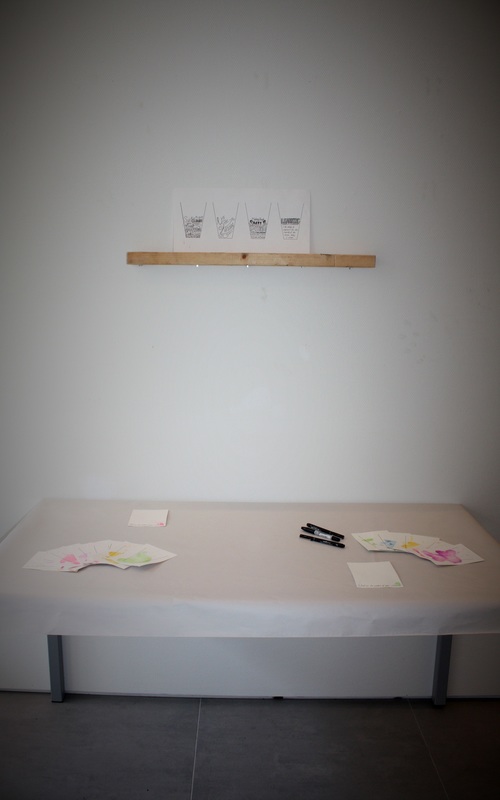
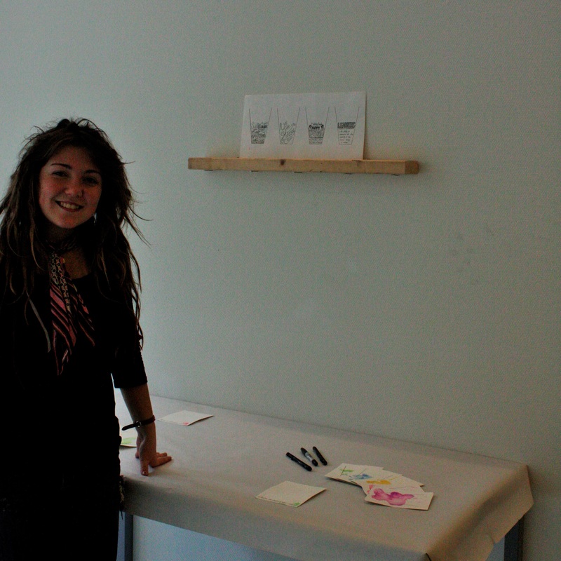
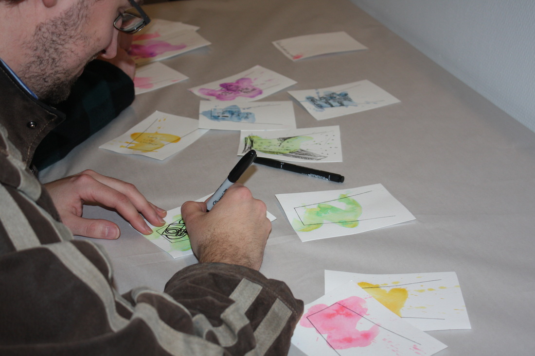
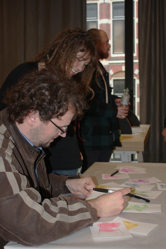
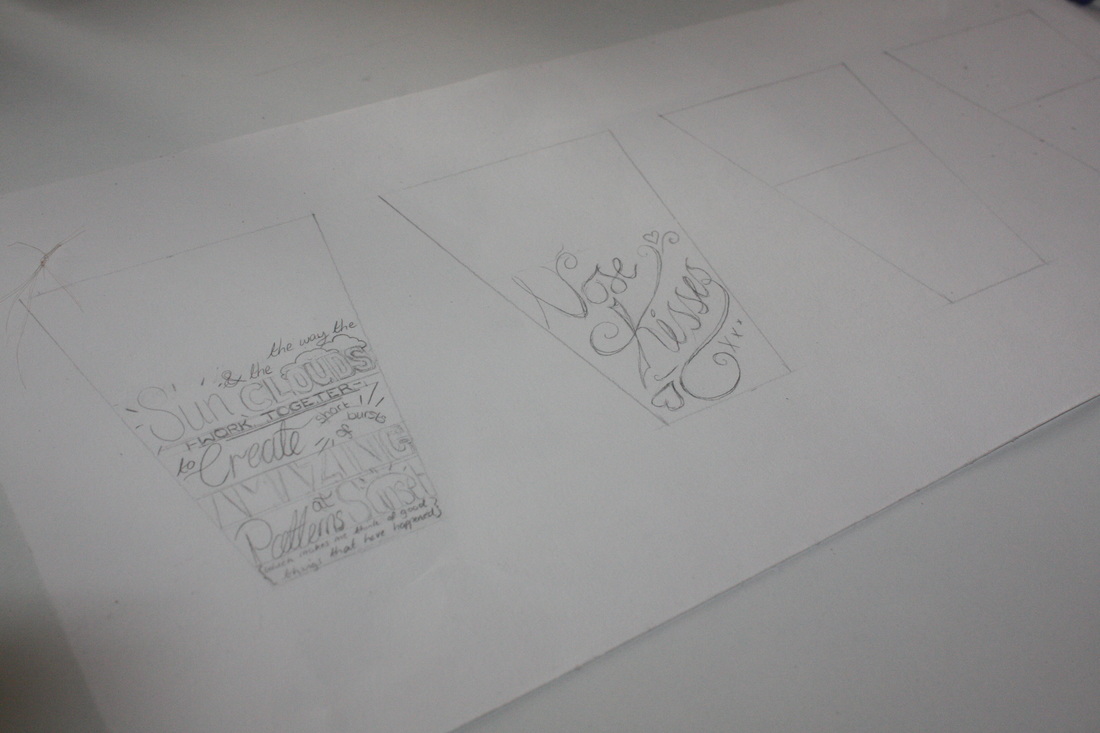
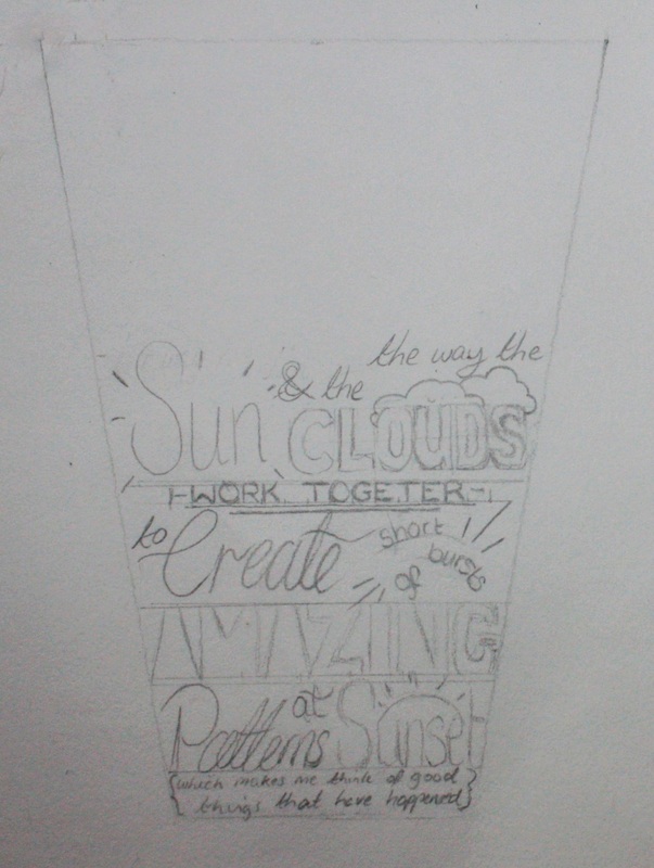
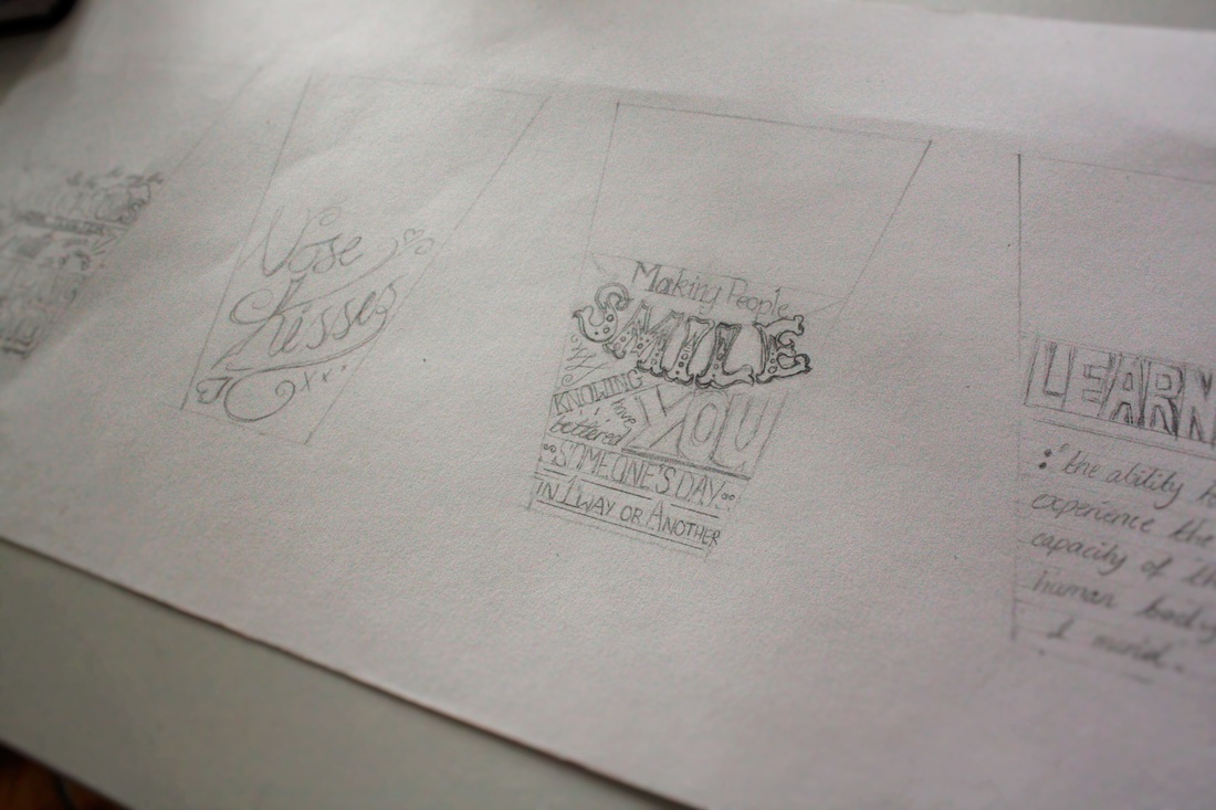
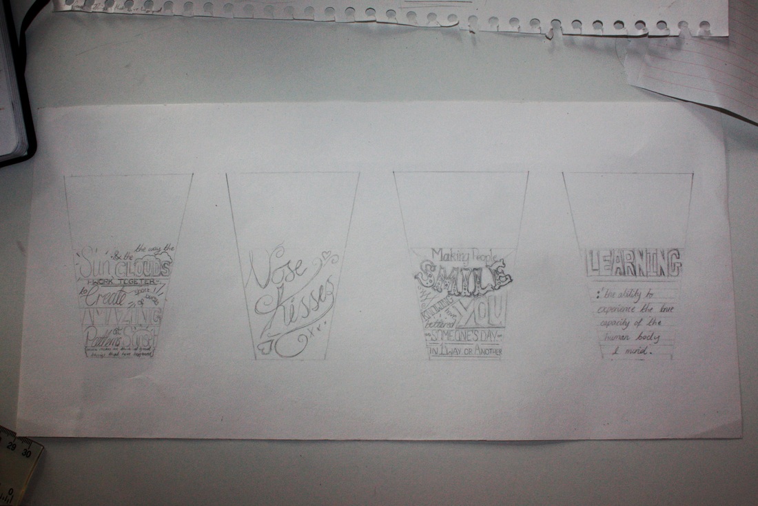
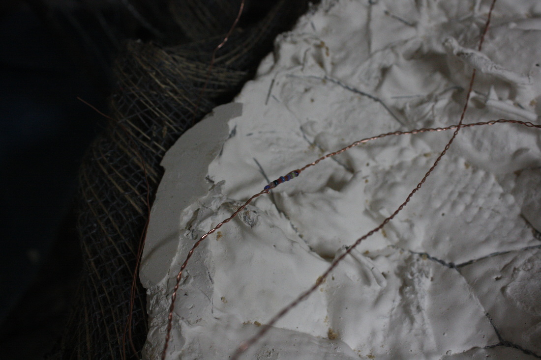
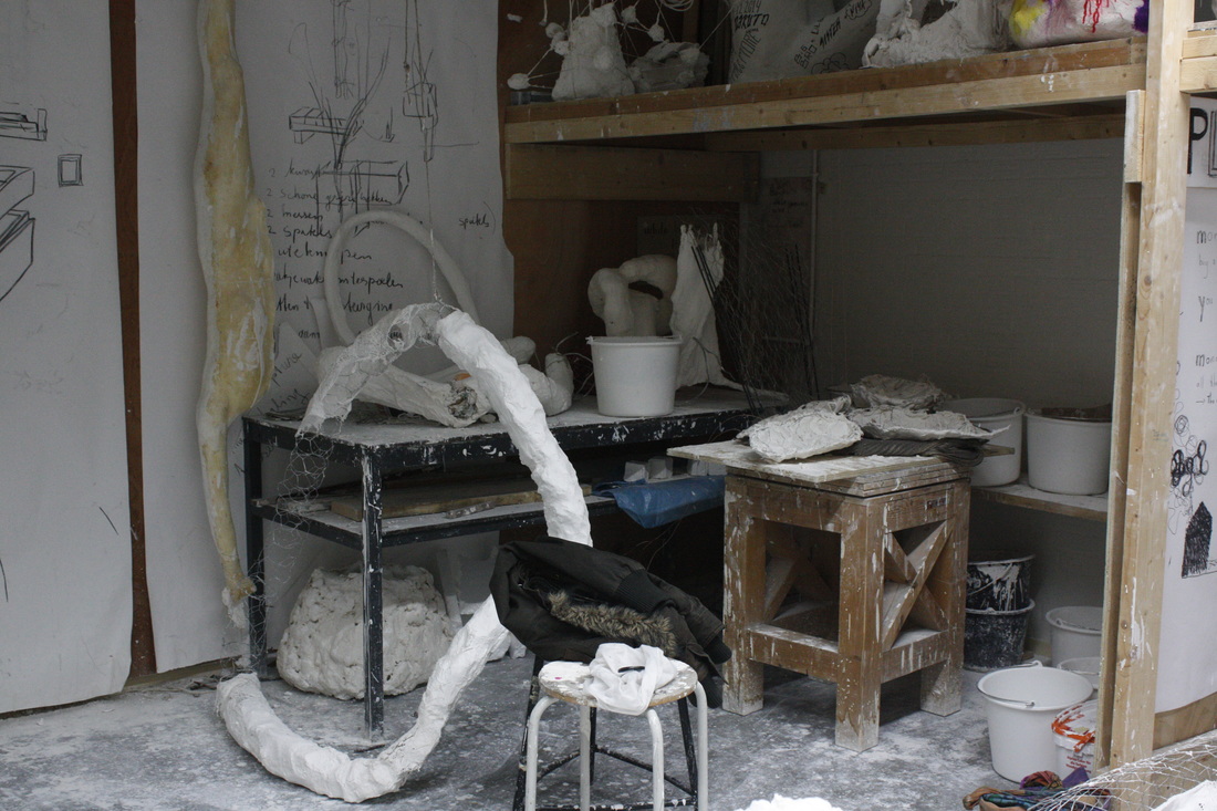
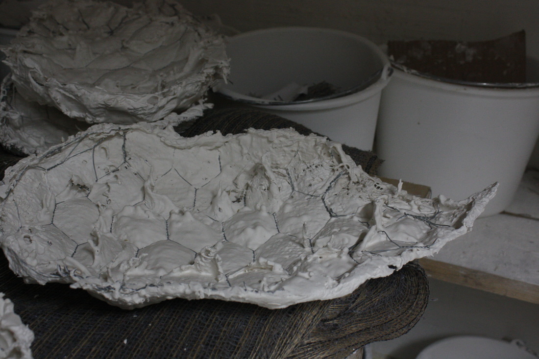
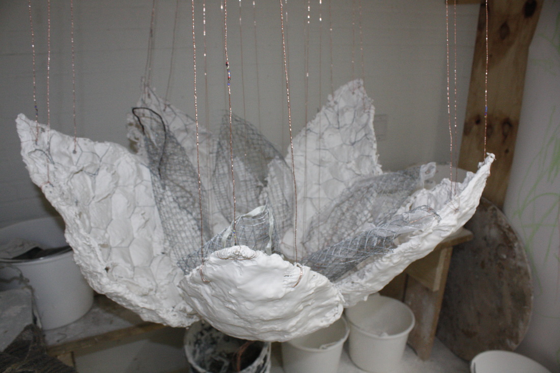
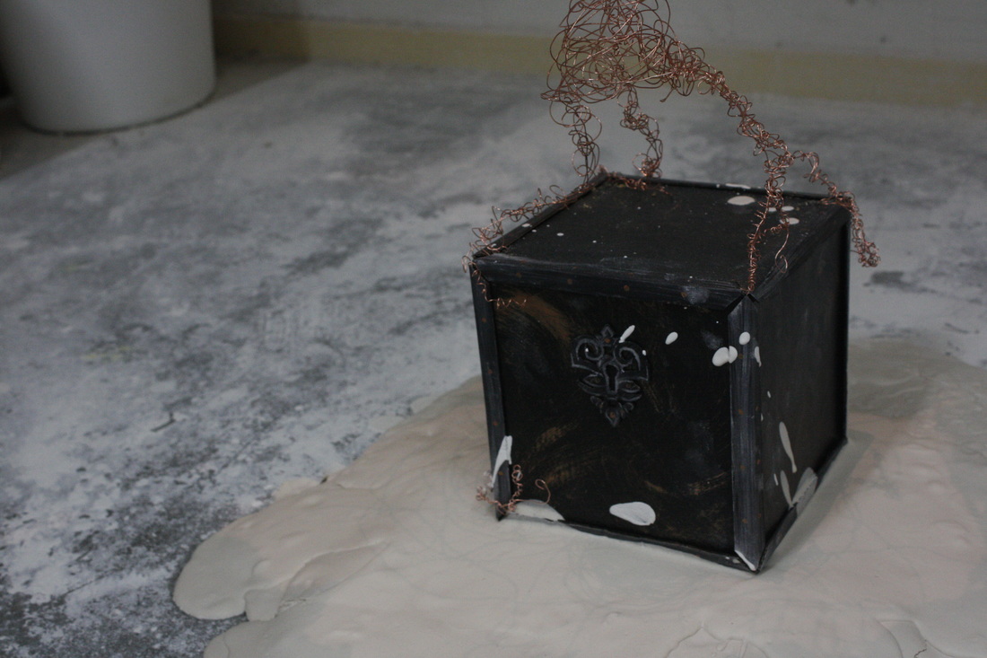
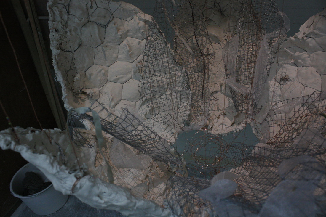
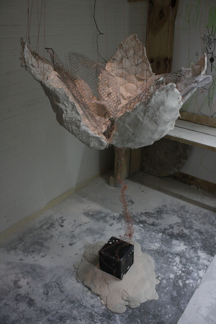
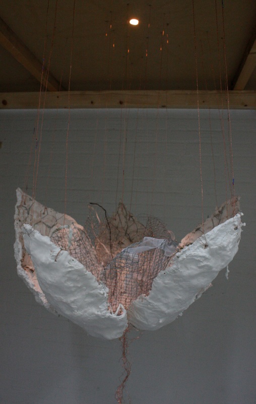
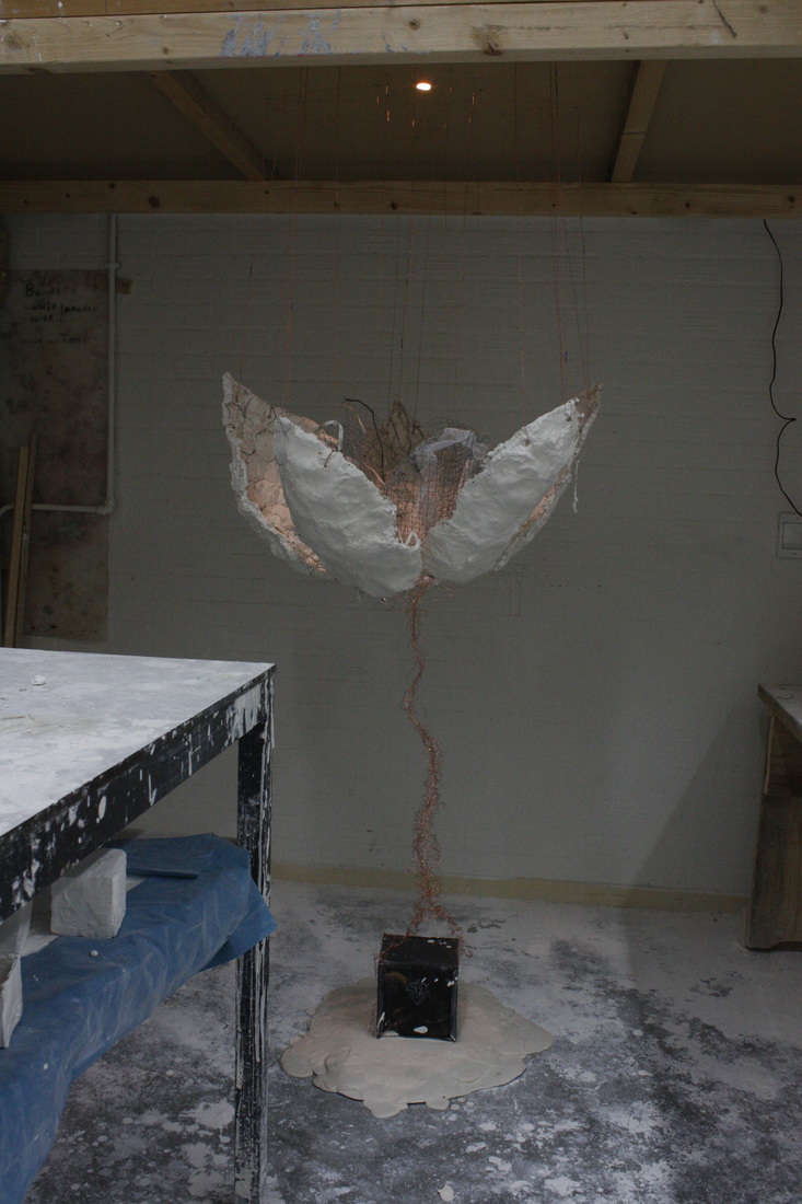
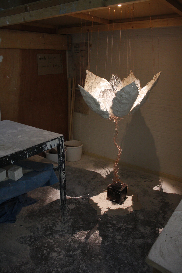
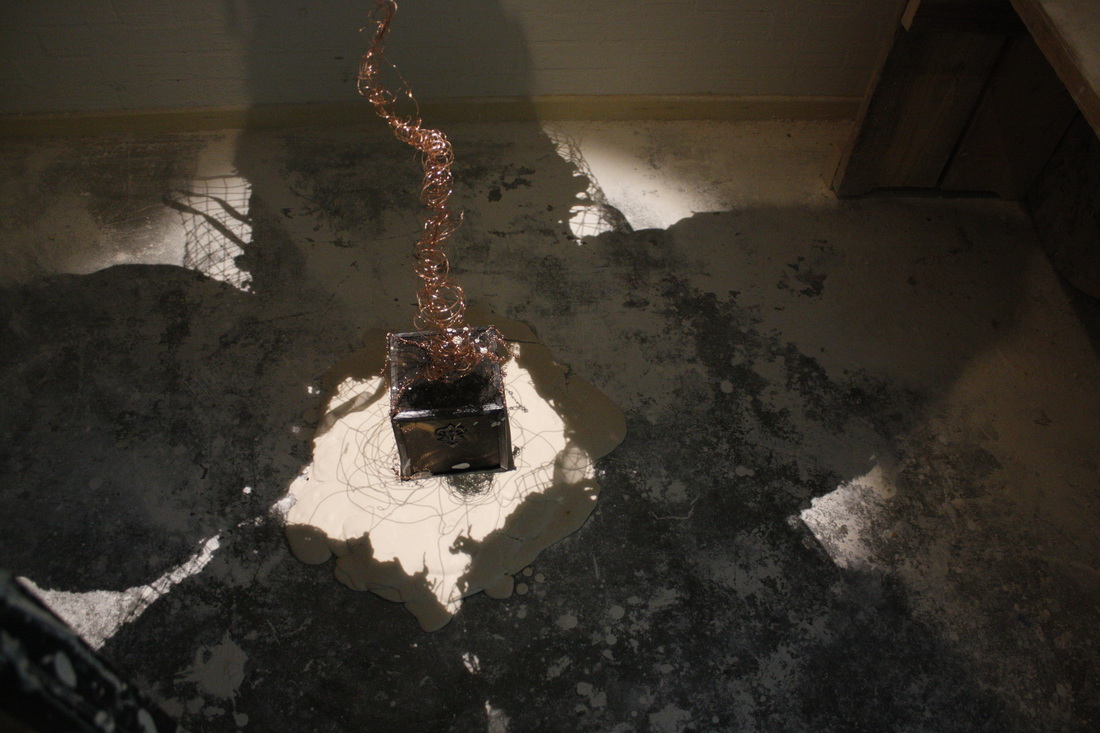
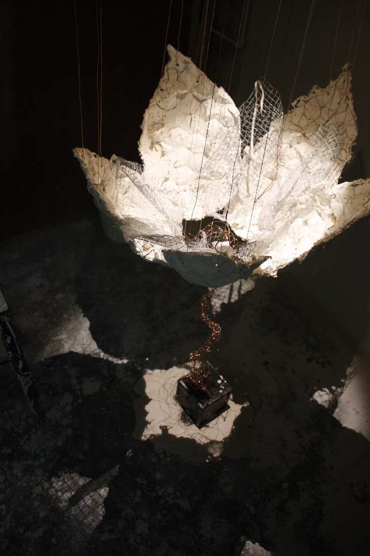
2/11/2015 0 Comments Hand Lettering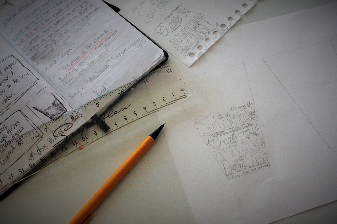 Inspiration: Mythology and PositivityOne of the reasons I was so interested in attending Minerva is its wide range of courses and in depth theory and philosophy classes. I sometimes feel my English Arts education forgets the importance of academic research and literary skills, as well as background philosophical inspiration which is rarely covered in the syllabus. However, here in Groningen we are consistently engaged in two theory courses and an extra choice of theory class. Last block I chose Mythology which was a fascinating course and intrigued me for its moralistic and imaginative qualities. Wanting to further this research I started reading about mythology in my own time and soon found a concept that connected to my beliefs and the passions that I like to spread in my work: The River Cocytus. One of the four rivers of the Underworld according to Roman Mythology it was "the river of lamentation; it was by drinking the waters of this river that souls fully realised the wonder of life and came to understand all that they had lost by dying" (Roberts, M. J. 1994, Myths and Legends of Ancient Greece and Rome). In this circumstance it is a torture, made to instil regret and dissatisfaction with the existence of the souls and it reminded me how important it is that we exercise gratitude every day and realise the beauty of this world before we leave it. Therefore, I took it upon myself to bring this opportunity for enlightenment into our lives. I started brainstorming ideas of how to visualise this experience of drinking and awakening from our inappreciative conscience. I soon updated the concept connecting it to the common philosophy "Is the glass half full or half empty?". And soon I was spreading the word on social media that I was in need of peoples opinions of what the wonders of the world are for them. It is important to me that rather than pushing my values on others I can remind people of their own values and stimulate gratitude and appreciation for these personal things. These opinions I have now been transforming into simple cup shapes, half-filled with artistic hand-lettering. Hand-lettering and typography is something I find beautiful and intriguing. Whilst I have no training in the area I have enjoyed experimenting by copying different fonts and making them my own. I find Pinterest a huge source of inspiration and also motivation as it is evident how appreciated hand-lettering is at the current time. The above image shows the process from choosing written quotes to planning and creating the base sketch whilst below you can see the stages and final result of my first piece in this style. I am pleased with the result but know that this is just the beginning... Making a Start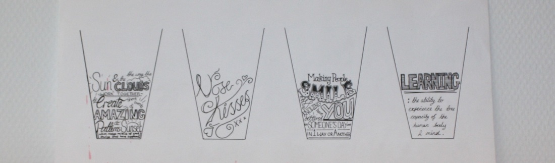  Plaster and SymbolismMy course requires me to take a subject class each block that constitutes a project focussed around a particular material. Similar happens in the first year at my English University however, here the development of practical skills continues throughout your education giving continuous opportunities to develop interests or learn something new simultaneously with your personal practice. Having free range of materials in previous sculpture courses (and choosing to focus on metal, wire and paper) it was quite a shock to arrive at my first subject lesson in the Netherlands and be told the next eight weeks would be dedicated to plaster and chicken wire, a new and daunting quest for my practice. The brief didn’t make things any more homely. Our request was to create a self-portrait – not too bad huh? The setback was that it could be anything but figurative. That’s right – make a sculpture of yourself that doesn’t look like a person. To the more logical readers this may sound ridiculous and perhaps in essence it is as a few dropped out of the class after receiving this gem. However, I felt an anxious excitement build inside me as I realised how unique this concept was. And as an artist focussed on everyone but myself why shouldn’t I fully indulge in the artistic ego this project? Coming up with a plan took a fair bit of pencil tapping I will admit. This struggle led me to admit that I am no abstract artist but within this defeat I realised my passion for symbolism and its connection between social conditioning and hidden meanings. Eventually I drew resources from my childhood and my interests to symbolise my development over time:
We all have the opportunity to work hard and become more, those who deal with loss need hope and support, not lower goals. The Making ProcessHonestly, I believed the piece to be a disaster throughout the majority of the making process. The material was new and strange, the process was long with a variety of techniques to choose from and my aim for a ‘fragile-looking construction’ threw up multiple practical issues to be addressed. However, I let myself enjoy the process, dealing with problems in a fun and experimental way and discovered some wonderful things. For example if you pour plaster repeatedly it forms puddle-like waves and if you splatter an extra layer whilst the second is still wet it resembles the effect of water dropped on sand. Plaster can also be left very rough and the process often produces interesting contrasts between rough edges, perfectly smooth surfaces and plaster stalactites that form whilst drying if you are generous with your plaster. All of these effects were used to form a more interesting final result. A brief explanation of my process is as follows:
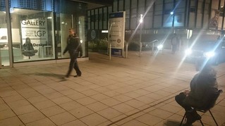
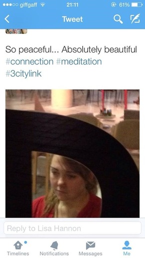
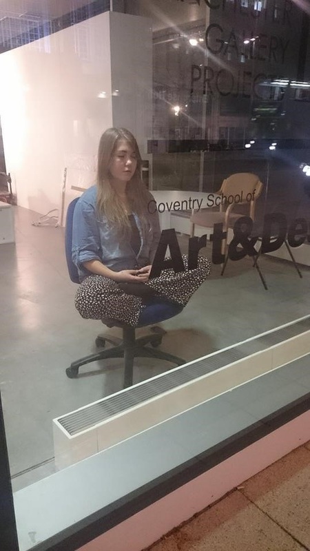
 24/10/2015 0 Comments An Interview with the Artist...Below is an interview between myself and Safira, also a student at Minerva, regarding 'The Pigeon Project' I completed as part of my studies last academic year. Having studied analysis techniques we have now been set the assignment to write an analysis of each others work which the following interview will become part of. If you are interested in art analysis expect more of this assignment to be published in the coming month. [The interview is as summarised by Safira and is published with her consent.] 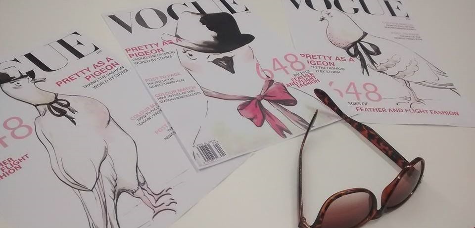 Interviewer: Safira Taylor Interviewee: Coral ST: Why did you decide to work with pigeons with your work? C: I had hit a block with my work, and my tutor tried to help me overcome this by saying ‘what do you want to do with your work/ what is the aim of your practice?’ and from that I realised, that although it’s a very broad concept, I want to make people happy. As simple and as complicated as that is. I started doing some typography work, writing different words and looking up the definition of peace and of happiness. My tutor then told me that my concept was too broad, and it would benefit me to minimize it as far as I can until I get a focused metaphor for my broader concept. Pigeons became my metaphor for viewing things in a positive light and therefore bringing happiness. ST: So you decided to use pigeons to bring happiness to viewers? C: Yes! I was trying to teach my viewers that you choose your own happiness. If you view things in a positive light, and choose to see the best and appreciate beauty in the little things you can achieve a higher happiness. The pigeons came about because they’re such a common subject; everybody in England has to deal with them everyday. They’re relatable to other cultures as well; we’re here in the Netherlands and we have exactly the same problem. Pigeons are unnoticed or physically hated in lots of places, people even kick them and get aggressive with them. They’ve introduced birds of prey in Trafalgar Square in London to kill and deter pigeons, despite it being renowned for pigeons, like the beautiful Mary Poppins scene! It is really becoming an active thing to kill off these birds. ST: Yes and they’re so close to Doves, which are seen as such a holy bird. C: Yes doves are seen completely differently and I think there’s a lot of irony in it. I’m quite an ironic, sarcastic person, I guess that’s quite an English thing, so I thought the fact that we hate pigeons was a really ironic statement. A lot of them are disabled with broken wings and damaged legs, and they’re dirty. But the thing is, originally pigeons were seaside animals, they would have lived in cliffs, and looked perfectly fine, the equivalent of a seagull. But because we turned our cities into high rise buildings and cathedrals we created a place for them to live inland, and because we drop so much litter, we made it easier for them to find food amidst our rubbish. Then we put out spikes to stop the pigeons from landing, which then damages their legs. So all of these things are caused by our negative development on nature, but we judge them. I saw it as this really sarcastic thing; we’re being so horrible to these animals, when we ruined their nature and their habitat. It made me think a lot about the way we treat the lesser fortunate in our own societies, the way that when people have to live on the streets, we judge them for being dirty, when our streets are dirty. So the pigeon became a very weighty metaphor for me, while still being fun, approachable and recognisable for everyone else. ST: Yes I agree, it’s also quite risky though because lots of people may look at your art and think ‘ew why does she have a pigeon there?’ How do you force them to think in your way? C: Even when I get those people that look at my art and think ‘why the hell have you painted a pigeon’ I feel like that is a result for me. I know that it’s making them slightly more aware of their own disgust for pigeons, and the next time they see a pigeon in the street, they will recall my visually aesthetic art and associate it with the creatures. So whether they notice it, or whether they intend it, they will always have a slightly more positive outlook on the birds. As soon as you manage it with one thing, it’s already the start of a better habit. It’s a subconscious link. The amount of feedback I got from people who didn’t like pigeons but still appreciating the colours in the panting, and I’m like ‘that’s what they look like! Have a closer look, they’re beautiful!’ I am a bit of an activist but I don’t want it to be in a confronting way. ST: I think that’s good, because then your work will appeal to the masses, do you agree this is very important with your type of art? C: Yes, you don’t want to intimidate people. ST: My next question was about goals within your art, I think you’ve covered most of them already? C: Yeah it’s mainly about happiness and improving lives in a fun and sarcastic way. Society is a massive influence for me, it’s also a personal interest, I like to read about philosophy of society, and that comes into my inspiration. ST: Which artists inspire you? Your Vogue covers reminded me of fashion designer’s sketches. C: My work varies so much, so it’s hard to say that any one style is relevant. I have a massive love for Marina Abramovic and Grason Perry. Mostly because of who they are as a person and their points of view. My work is very broad, but my viewpoint is getting people to view things differently, and I feel like Marina Abramovic and Grason Perry do this. Grason Perry makes something look beautiful then you get closer and it has reality on it; it has swear words, and ugly truths about the things that happen in the world. He is also very sarcastic and confident in his work. He is known as the transvestite potter from Essex, the fact that he can be so forward with who he is is a massive inspiration to me. Abramovic manages to have a dialogue with society without words, like in 512 hours and The Artist Is Present so this is also similar to my aim. ST: Why did you choose to make your work so accessible? C: I think it’s an issue with the art world today, that we see the art world and the public as separate. If my intention is to improve lives, why should only the people who are interested in the depths of the art world gain anything from that. I also appreciate multiculturalism and want my work to be accessible to everyone. 28/8/2015 0 Comments City MeditationThe following is an exert from a brief write-up on a project from last year that became a successful exhibition and a turning point in my practice and my appreciation for performance and sound 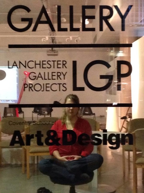 "My most recent work was ‘City Meditation’ which stemmed from an interlocal collaborative project called #3CityLink and was exhibited in the Lanchester Gallery in the centre of Coventry. It was an important project for myself because I really pushed my practice to a new level. The piece began as 30 minutes daily meditation in the gallery window in an effort to create an indirect dialogue with the passers-by whilst opening my beliefs to the public and observing their reactions. It became a huge part of my practice, spreading awareness of minority Buddhist culture and the stereotypes and responses it gets from today’s society. This is a strong example of how my practice connects with people on a personal level and aims to impart knowledge and understanding on its viewer. The final exhibit was a multi-disciplinary installation including projected video, written notes and sound via headphones with a 30 minute performance of myself meditating on opening night. I chose this combination because to an extent it engages everyone who passes as a performance tends to warrant more attention than an inanimate piece and evidences how personal this project was to myself and others with similar lifestyles. However, my work does not aim to shock or intimidate and so the headphones and notes were an open invitation to gain insight into my practice; further proving the way people respond differently to cultures they do not understand because (as seen on the video footage of my performance) some are much more open to these intuitions than others."
|


 RSS Feed
