|
16/3/2018 0 Comments Pies to Pompoms
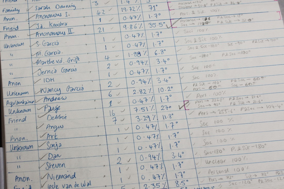
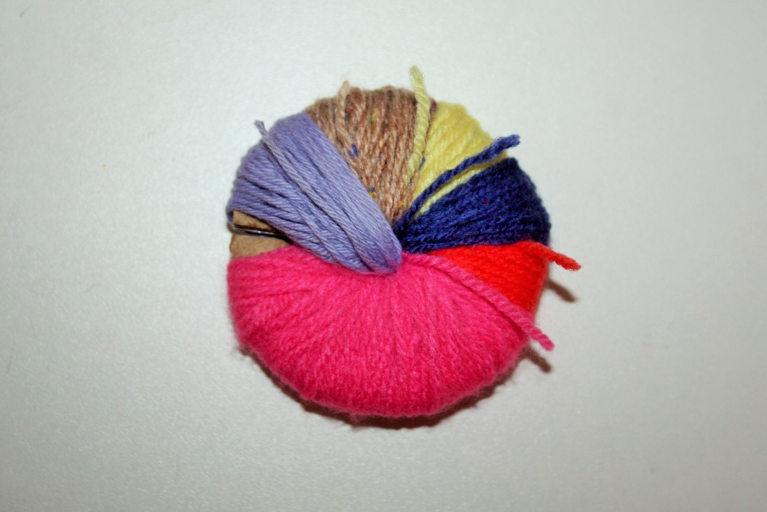
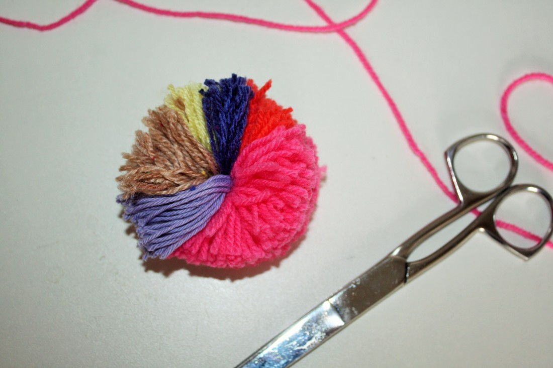
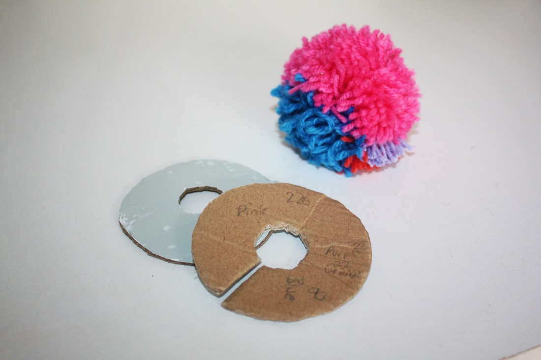
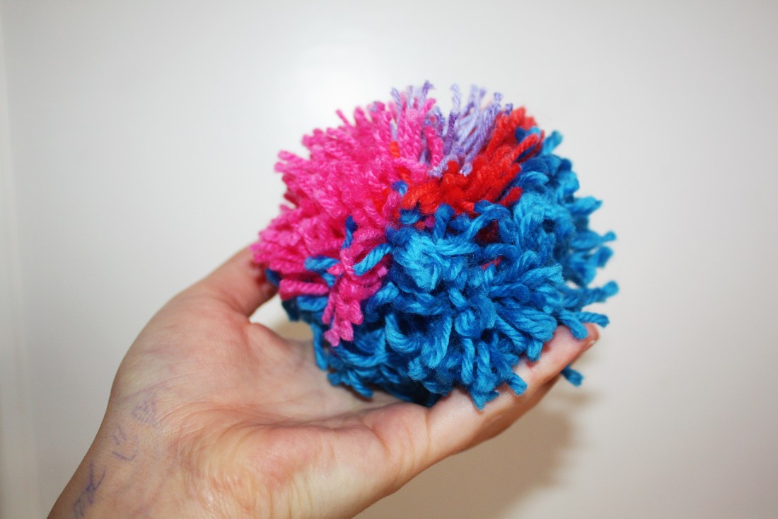
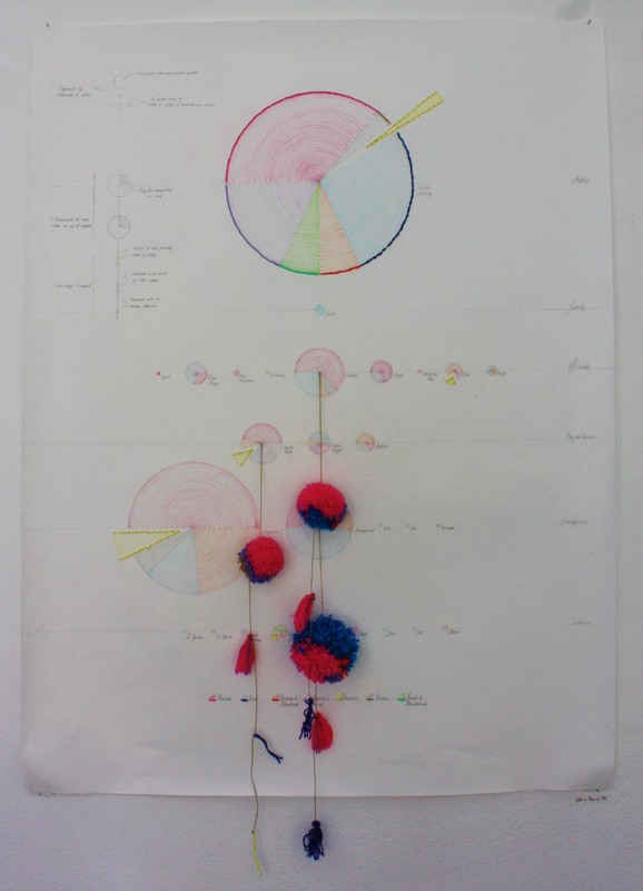
I then tried a couple ways of making the 'pom-charts' by cutting the cardboard ring to scale to the number of comments as in the drawn versions and drawing on the pie chart lines to fill each section with the relevant coloured thread. I found the most accurate way was to count each wrap as one degree of the pie-chart meaning once cut the pompom has a dense fluffy appearance with exactly two threads per degree.
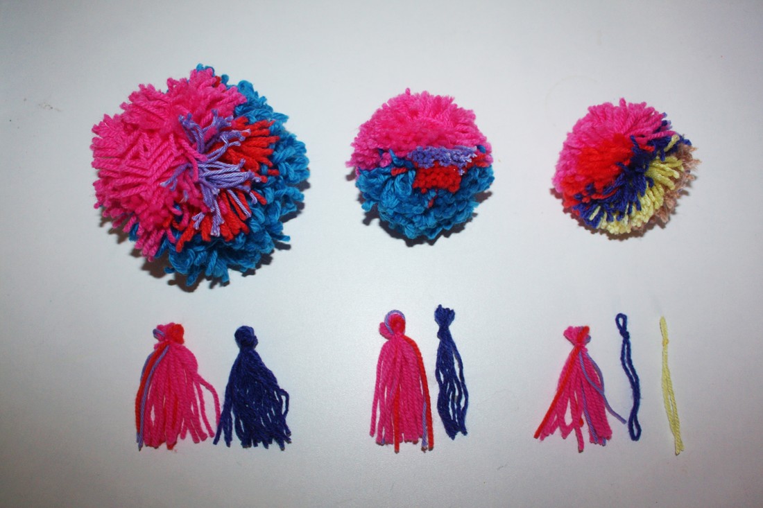
I then made tassels to separate the comments by who initiates the problem mentioned. For these each wrap equated to one comment which meant once cut every comment became two threads. The first group (pink, orange and purple) reflect the issues that are at least partially initiated by oneself. The second (blue) are caused by other people or society at large. The tiny third group (yellow) shows non-human initiated or 'situational' issues. I felt this was a great way to give a tactile representation of our own responsibility for the problems faced by ourselves and others whilst retaining a playful, upbeat aesthetic.
These were connected to the original artwork with the same thread as used to bind my series of 'Tired' books that inspired the piece by piercing the centre of the correlating 2-dimensional pie.
0 Comments
|
 RSS Feed
